
PAYMENT USABILITY
FOR AIRBNB IN INDIA
Iterative research // Usability testing // Content testing // Mobile & web
About this project:
Payments is one of the largest barriers for Airbnb's growth in India. This initiative aimed to update the India checkout experience to be more localized to the unique payment needs of the market. I conducted usability and content testing on high-fidelity prototypes for trip planners in India.
PROBLEMS
Travel in India accounts for 1.6 billion annual domestic trips. However, among Indian Airbnb users, checkout and payment is one key barrier to adoption. Due to local regulations, Airbnb India payments are processed through PayU. Users in this market see a different checkout screen that is not optimized for the India consumer, including:
Paying online involves multiple redirects that route to external websites
The current payment experience routes through PayU and consists of redirects to external pages and multiple loading screens before a payment can be processed. This causes user frustration and drop-off.
1
2
Limited payment method availability
Indian consumers are used to paying for their e-commerce purchases through many types of payment methods. Airbnb currently only accepts Credit/Debit card in India.
3
Limited optimization for mobile web shoppers outside the Airbnb application
The majority of Indian users own Android devices and navigate to the Airbnb website rather than the mobile app. Currently Airbnb.com is not optimized for mobile web use, especially at checkout.
GOAL
Given that payments is one of the largest barriers for Airbnb's growth in India. This initiative aimed to update the India checkout experience to be more localized to the unique payment needs of the market.

Our goal is to provide a payment system that enables Indian consumers to seamlessly pay like a local using any Airbnb platform.
PROTOTYPE & CONTENT
A cross-functional team of designers, engineers, product managers, content strategists, and researchers collaboratively developed prototypes aimed to improve the existing payment process for users in India. After several rounds of testing on the initial design, my role was then to support testing as we added additional payment methods and sought to finalize content selection.

METHODOLOGY
Remote unmoderated usability testing with Indian consumers on Usertesting.com
Participant criteria:
-
Planning a trip within the next year
-
Responsible for booking and paying for trips
-
Pays primarily with either Netbanking, Paytm, UPI, or Credit/Debit Cards
-
5 users assigned to pay with Netbanking
-
5 users assigned to pay with Paytm
-
5 users assigned to pay with UPI
-
5 users assigned to pay with credit/debit
-

I specifically did not recruit Airbnb users. This helped us observe the usability of the payment experience from the perspective of novice users, and would provide a more stringent test of whether the platform generalized to other common payment experiences.
INSIGHTS & RECOMMENDATIONS
Insight 1: Users were easily able to pay using one of their preferred payment methods.
“This definitely aligns with my expectations.
I know exactly what to do here.”


All participants
were successfully able to select a payment method
Most participants
were able to select their first choice payment method
Recommendation:
Clearly state all accepted payment methods
Some participants did not realize their first-choice method was available. Place all method options in the same drop down menu, including additional options for Google Pay, Apple Pay, and TeZ.
Insight 2: Participants found the experience aligned with or exceeded their expectations from previous payment experiences.
“Quick, easy, good experience.
Just like what I am used to, if not better.”
“Very similar. Exactly like what I have done in the past. Anyone will find the experience hassle free.”

Insight 3: Participants reported confidence that their transaction would be secure, though note that additional security messaging can't hurt.

“I am confident that my money is safe.”
“It definitely feels secure, but you could add more, like telling me that my transaction is secure.”
Recommendation:
Perceptions of confidence could be improved with additional security messages, such as a visual lock box or explicit language stating “your transaction is secure.”
CONTENT RECOMMENDATIONS
We tested several screens to assess functionality of different content variations. This testing was introduced to participants after the primary task was completed. Participants were shown all versions and asked to explain what they think each option means, why, and which is preferred for them.
Screen 1: Mobile verification

Option 1

Option 2
Participants liked the term “mobile banking app”
-
"I like that this tells me I need to have the app on my phone.“
-
"I like that it tells me that I need to make sure the app is installed and active.”
Using “hurry” induces panic. Let’s avoid it.
-
"This makes me panic."
-
"This feels too urgent, don’t create a panic.”
-
“This makes me suspicious.”
Participants preferred "Use your phone to finish paying”
-
"I like this much better, it’s more clear and straightforward.”
Recommendation:
"Use your phone to finish paying.
Approve this payment using your mobile banking app.
Make sure it’s installed and active on your phone."
Screen 2: Timeout error

Option 1

Option 2
Participants preferred instructions to check pricing info.
-
"This one is more alarming, but more accurate. Sometimes the prices do change and you need to know that.”
-
"I would prefer this because it gives me a better idea of what’s going on... it tells me that pricing details might have changed.”
In this case, more information seems better.
-
“In comparing the two options, more information is better.”
Recommendation:
"Let’s try again
Time ran out before your payment was approved. Try again, and check pricing details first in case they’ve changed."
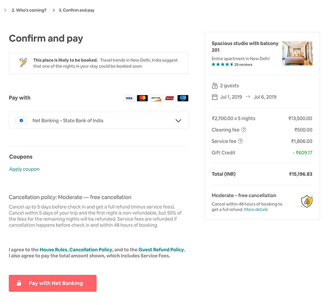
Screen 3: Continue to final payment step

Option 1

To participants, "confirm and pay" means final step.
-
“Once I click, I make the payment right now.”
-
“This means I'm not moving to a third party. The payment is made here.”
"Continue to pay" means there's more to come.
-
"This means I will enter more information on the next page."
-
"I will be directed to another party to pay.”
-
"There is another step after this.”
Recommendation:
"Continue to pay"
This language most accurately communicates that there is an additional step, including a redirect to another site.
Option 2